


Wayfinding in stations, especially underground, is confusing. Line of sight is minimal, there are no off-system visual clues, and orientation is difficult. That is where graphic ingenuity can be used to compliment traditional signs and maps.
Our blog has largely cast its attention over wayfinding for pedestrians, whether that be through an urban cityscape or around a public transit network. Much of our focus has been related to map-based information products, and we’ve explored how these tools can be employed successfully to make the city or network ‘legible’ for those required to navigate it.
Two-dimensional maps face a stiff challenge when it comes to representing the multi-levelled real world, and this struggle is intensified when a particular location is beneath-ground or within a large, often multi-modal, station complex. Added to the mix is the necessity to enable an efficient, safe flow of pedestrians and passengers avoiding congestion points. Wayfinding in such environments needs to be intuitive, and therefore it is easy to see why directional signage often takes the lead. The directional arrow, that most ubiquitous and universally understood wayfinding symbol, is king here – although subtle differences in its employment can improve or lessen its effectiveness.
However, some public transit agencies are introducing additional methods to bolster their wayfinding arsenal, tactics designed to build on the immediacy and directness of arrows and pointers, and also draw in more network and brand-specific elements that seek to guide and reassure their customers.
One such recent example is the adoption of coloured handrails on escalators in certain stations of the Washington Metro. A simple and quickly understood aid to wayfinding, this builds on the fact that the Metro network has adopted colours for line names – therefore, at an interchange station such as Fort Totten, red handrails on an escalator will lead you to the Red Line platforms, green and yellow handrails to the shared Green and Yellow Line platforms.
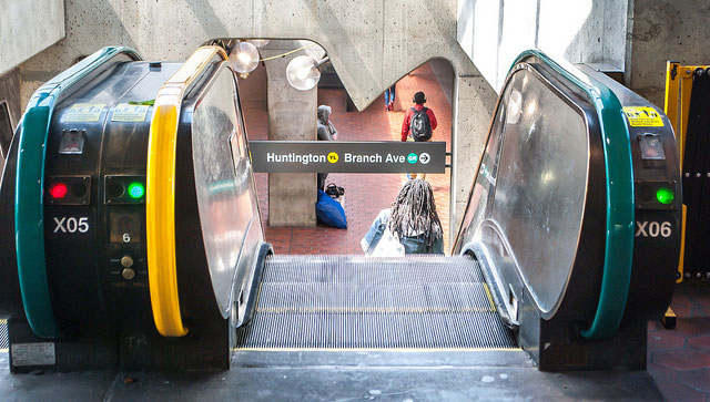
The colours appear to have been given an extra glossy finish, especially if you compare them to their counterparts on the Metro’s network map, possibly to further lift them out of the dull concrete and steel background. There may well be limitations though, and this strategy may struggle on networks of greater complexity than Washington’s or where banks of three-or-more escalators are used in contra-flow arrangements during peak hours, or just simply where you want to indicate that you are travelling from rather than to a particular line.
A network of undoubted intricacy is Paris’s own Métro, and here we find a ‘follow the feet’ approach to guiding users from one line to another while interchanging below the streets of France’s capital. Saint-Lazare, the second-busiest métro station in Paris, directs passengers to line 9 (whose platforms are technically at Saint-Augustin station) by asking them to follow printed footsteps – coloured in line 9’s specific shade of yellow/green and applied to the floor of passageways and corridors. Perhaps this mitigates to a degree the mixed-messages as to the availability of line 9 at Saint Lazare – for example, it is shown as a valid interchange on the network map between Saint-Lazare and Saint-Augustin, but does not appear clearly in-car on line diagrams on line 9 itself.
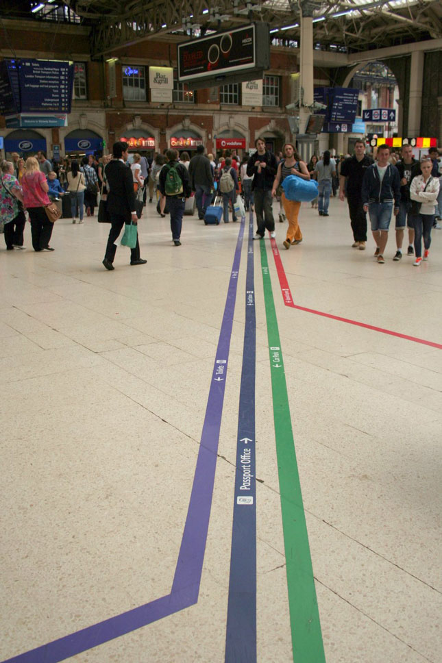
Floor graphics make an appearance in several other cities. Victoria mainline station in London is a very busy commuter terminal, that also has to contend with a large number of overseas visitors arriving and departing on trains from London’s second-busiest airport – Gatwick. The station applies continuous linear strips that lead people to (and from) the appropriate area of the station for their needs, and this includes those travelling on from Victoria by coach, taxi, or on London’s Underground. It could be argued that those who have a degree of colourblindness may struggle to separate out purples, blues and greens, so the coloured strips also act as backdrops for directional arrows, short descriptions and pictograms as repeated elsewhere in the station on conventional signage.
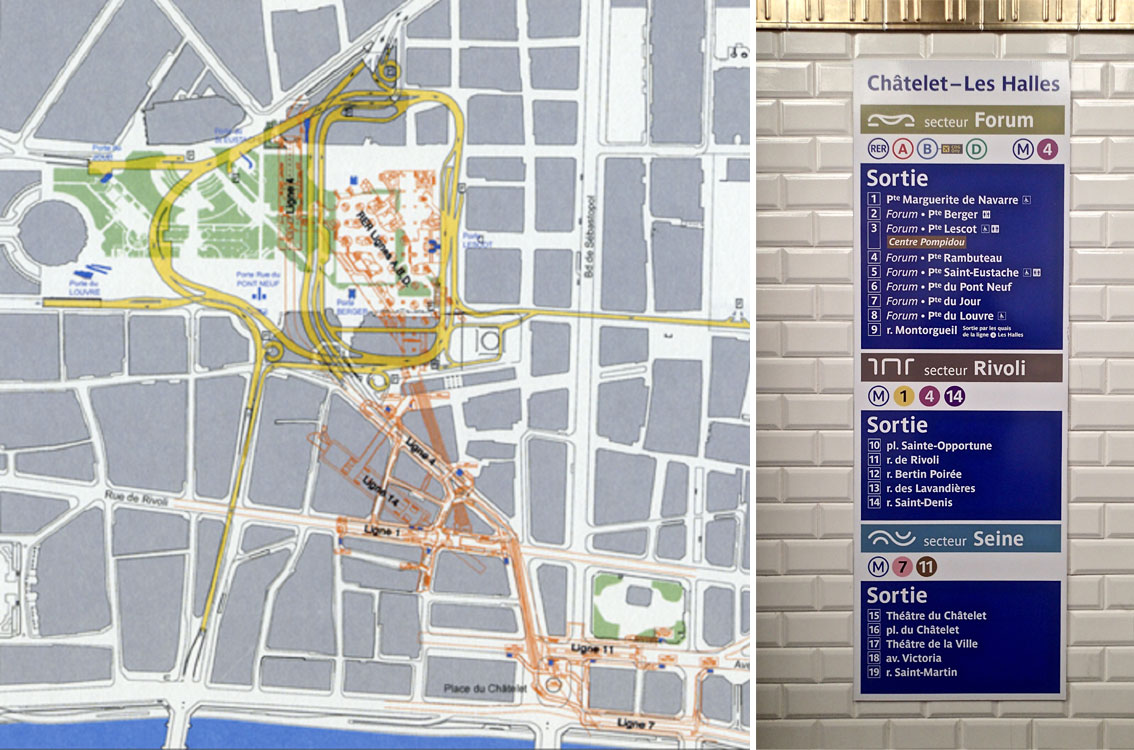
Returning to Paris, and specifically to the station at the heart of the métro network at Châtelet. An interchange hub for no less than five métro lines and three suburban RER lines, and existing entirely sub-surface, Châtelet has recently been thoroughly refurbished as part of a huge redevelopment of the surface-level retail space and public realm. As part of the changes the station was split in three ‘secteurs’, each given a name designed to orientate the passenger. This sectorisation is perhaps not the most intuitive device for anyone unfamiliar with the geographic footprint of the station, lacking a degree of context when only used on directional signage, and so the first-time user may not instinctively appreciate the fact that the Forum, Rivoli and Seine secteurs equate to the northern, central and southern groups of entrances respectively.
As city populations grow, and the push to increase use of public transit intensifies, efficient navigation of these underground and in-building environments becomes increasingly important. These are just a small handful of a multitude of approaches to helping the user get around as quickly as possible, and offer a challenging undertaking to planners and designers tasked with retro-fitting transit systems often constructed a long time ago when such considerations were of a lower priority.
Image by Kyle Anderson, Cmglee and © Pedro de Alcantara