


“We do everything for a reason, never for decoration.”
This quote, taken from the website of Hamish Smyth’s new design bureau Order Design, says so much about the handcraft and attention to detail behind the design process. Designing can be a thankless task where much care, skill and hard work are invested, while excellent results seem effortless. As Hamish says:
“I told my friends I designed these maps and they say ‘You mean people have to actually design those things?’”
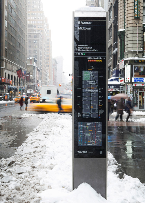
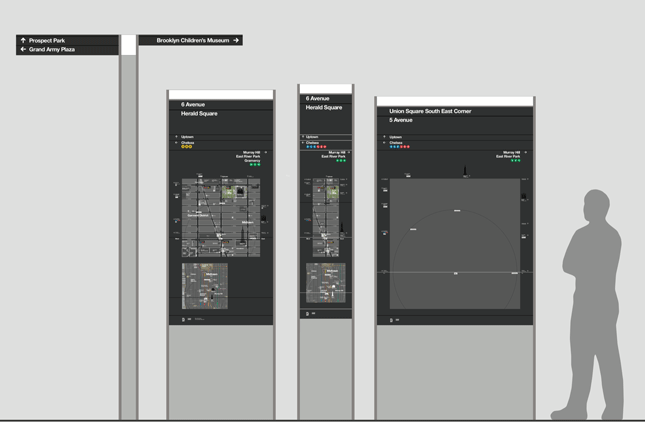
WalkNYC is a wayfinding system which belongs in New York. It feels as though it grew up with the city. According to designer Hamish Smyth, this was all deliberately and carefully planned. The process started with a lot of research into historic maps and New York signage.
As the commissioner at the time was excited about Legible London, the PentaCityGroup team began by studying that and similar wayfinding systems. However, a concious decision was made not to be too influenced, and it was the New York subway, originally designed by Bob Noorda and Massimo Vignelli of Unimark International in 1970, which was the chosen starting point.
“Our goal for the look was to seem like a natural extension to the subway as visitors to the city were already used to its graphic style. There is no point expecting people to learn a new system.”
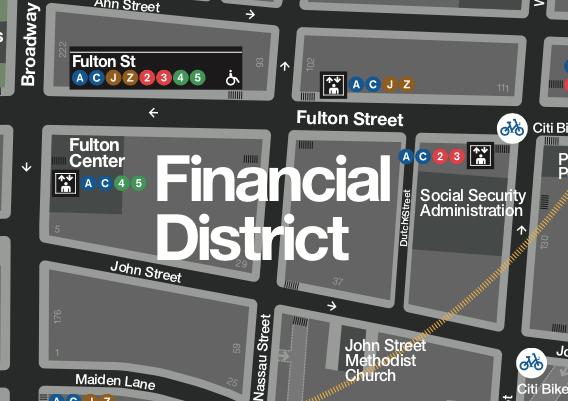
New York subway colours and fonts were used as a basis, with brightly coloured symbols for each subway line overlaying a dark grey background and the use of a special DOT version of the neutral, legible helvetica font, white on black. Very tight letter spacing makes it feel like its own graphic language, in fact so tight that names on the map become more like a graphic. Minimal spacing is also practical, as large area names don’t sprawl into neighbouring areas (NY has some long area names).
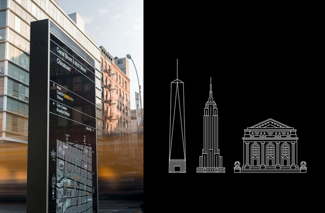
Other details reinforce the New York feel such as the sign infrastructure, which are tall and angular, in metal and glass. This design was inspired by skyscrapers, especially the UN building, with rigid sides and grass front and back. Many wayfinding systems have an eye-catching top piece for identification at a long distance (London’s is yellow, Toronto uses a bright lime green). However, most bright colours were used in the Subway already, and a sign mustn’t seem to point to a subway line. The resulting glass brick at the top was designed to catch and reflect the light focusing sun in the daytime and neon signs at night.
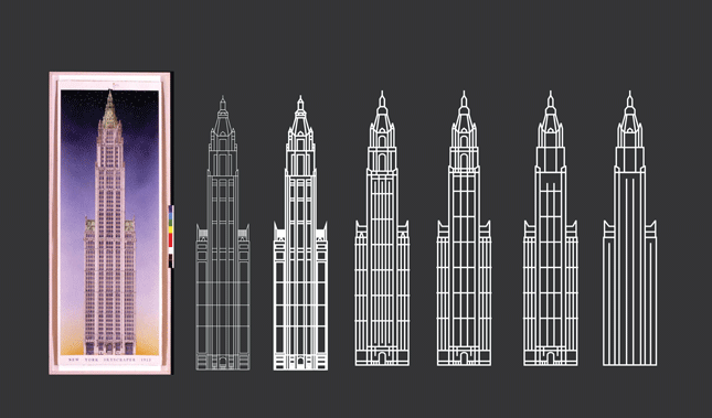
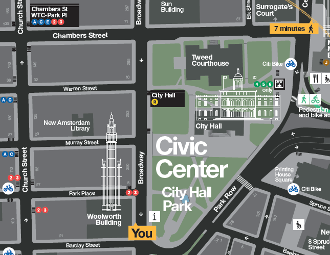
The building illustrations used to denote key landmarks echo the skyscrapers of the city, deliberate use of vertical lines emphasizing their height. The nature of tall skyscrapers meant that they couldn’t be depicted on the map at scale, or to fit the building footprint, for fear of blocking most of the map. transparent line diagrams meant the street behind is visible through the illustration. Hamish started testing with the Empire State Building and went from there. Once the whole of New York’s five boroughs was mapped his team had drawn 200 buildings.
With around 170 native languages spoken in New York, it was important that symbology would speak for itself. Hamish wanted these maps to be readable without depending on texts. He started with well established AIGA (American Institute of Graphic Arts) symbols designed in 70’s for American public spaces, airports e.t.c. These were then customised to give WalkNYC a personal touch, such as the fold up chair used to depict public seating or the I(heart)NY shopping bag.
Obviously most important for wayfinding is a good map, as this has a specific functional use. But according to Hamish, having a branded system creates a better user experience. A strong graphic identity helps people trust and recognise the information and the signs have a more official feel. It is also cool for cities to develop their own unique system. It shows the city cares about its people.
Mapping is also much more complex than designing a brand or identity. Map elements are inter-dependent, so just as you get the landmarks text size perfect it falls out of harmony with a lot of other features that were previously working well.
“It was the hardest work of my life. During the peak design period I was working 16 hours a day for six months. This was because of the overwhelming amount of tasks. I know T-Kartor had a mountain of work building up the basemap but we were making guidelines that they would follow to make the map. Change one thing then you have to change everything else.”
Add to this the fact that each new design decision must be motivated to the customer (DOT) in a long meeting, so mock-ups must be created and arguments prepared. After such a meeting Hamish would often work until midnight implementing all the decisions and addressing new problems thrown into the mix.
Hamish describes map design as being more like UX (User eXperience) design than other signage. The map frame should be seen as a graphic user interface as the designer considers how people read maps.
Where am I? – This is presented clearly in large fonts at the top of the sign. Where can I go from here? – The map shows at least five minutes walk, then major destinations are arrowed off at each side. Approach the map up close and the user sees a hierarchy of information, each feature with a prominence according to the order it should be reveailed. Features jump out and or recede depending on the colour used as part of a carefully crafted experience. How big should an icon be to feel prominent? Like a button on a digital interface it needs to stand out but shouldn’t be too big.
Hamish Smyth was privileged to get the chance to work on this defining project just five years after leaving design college in Australia. He obtained an internship at Pentagram under the mentoring of industry veterans Michael Beirut and Tracy Cameron and became part of the team of planners and designers that developed WalkNYC
“It was a real honour and dream job to get. The feedback for WalkNYC has been fantastic. More and more people are seeing it now as more signs appear around New York. The best feedback is when I see every sign in use every time I pass them. Even better is when I use the maps myself. I am always using them in areas I’m not familiar with. “
Note: While this article explores the design process behind map based wayfinding, Hamish is quick to point out that the WalkNYC wayfinding system was a team effort carried out by PentaCityGroup, comprising Pentagram, City ID, Billings Jackson, RBA Group and T-Kartor. Links to project descriptions: NYC DOT; Pentagram; T-Kartor.