


In our previous post, we briefly introduced Kevin A. Lynch and his pillars of city legibility; paths, edges, districts, nodes and landmarks. Mastery of these elements of an archetype legible and ‘imaginable’ city are still goals for city wayfinding systems today. However, there is enough scope and flexibility when putting these theories into practice that they permit each city to have a unique look and feel. In short, abiding by these rules of ‘good’ wayfinding need not suppress the uniqueness of a city.
To examine this further, we can compare the differences between online and on-street representations of a certain cities. We shall look at London, New York and Birmingham (UK).
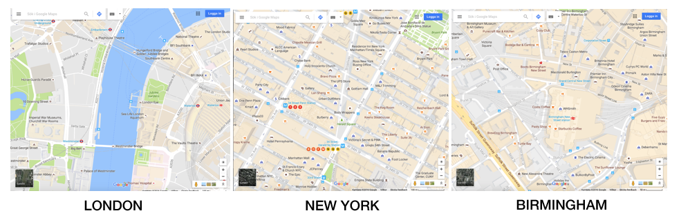
A generic, homogenous map design is used by the vast majority of digital applications, even those that are targeted at specific cities, largely thanks to the dominance in this domain of Google Maps. Indeed, it is hard to propose an alternative approach given Google’s (or Apple Maps’) aim of consistently representing the whole planet in digital map form. The digital user who can make sense of a Google map of London, is likely to be equally adept at finding their way around a Google map of Paris, Tokyo or Sydney.
But this standardised approach to representing the city environment can start to have an impact on the strategies Lynch developed for effective wayfinding. For example, how legible are navigational landmarks on a homogenous map if all points of interest are given near-equal prominence? And how imaginable are distinct city districts if they are all represented in the same muted tones, flattening out differences that in the real world may be quite stark?
It is possible to effectively map and depict a city by utilising striking aspects of its character. This, in turn, results in wayfinding that adheres to Lynch’s mantra of painting vivid mental maps in the mind of the user.
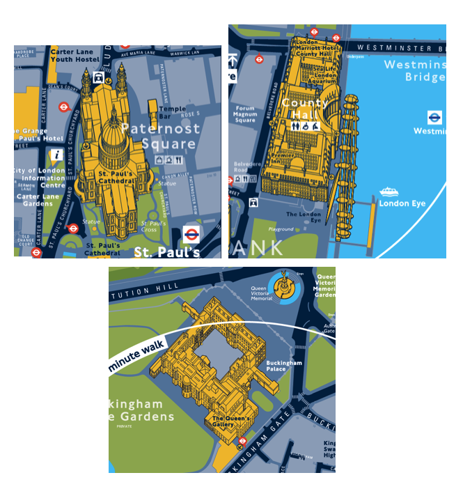
London: Legible London
London is one of the most visited cities in the world, with landmark buildings and attractions so well known that it is fair to say that many new tourists to the UK’s capital probably already have strong mental images of the cityscape even before arriving. St. Paul’s Cathedral, Buckingham Palace, the London Eye, all easily recognisable and symbolic of London as a whole. Legible London features about 750 of these landmarks modelled in 3D, each one instantly familiar and memorable to the user and an essential wayfinding tool.
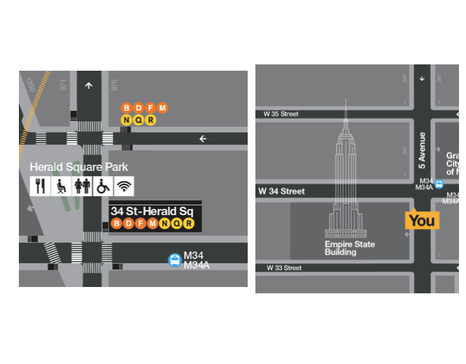
New York: WalkNYC
New York, particularly the borough of Manhattan, is renowned for laying out its streets on a grid. The wayfinding basemap developed for the WalkNYC system adopts this structure in a rigid sense, and purposely straightens out any real-world imperfections. This avoids any minor deviations in straight line paths that would otherwise be distracting and untidy. Pavement widths, rounded corners, near-parallel routes were all adjusted geometrically on the WalkNYC basemap, resulting in a map design that promotes the block and grid characteristic as the most important element of this wayfinding system.
The WalkNYC colour palette, designed by resident New York design agency Pentagram, has been deliberately selected to allow the cities existing transit iconography and signage to shine through. Dating back to the work of Massimo Vignelli in the 1970s, this instantly recognisable work of graphic design is considered so iconic that it has become an essential part of New York’s public image. It is therefore paramount that any wayfinding system employs high profile elements such as fonts and colours used for subway line, not only to be in harmony with pre-existing signage systems but also to reflect the NYC look and feel.
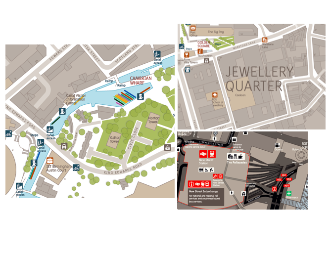
Birmingham, UK: Interconnect West Midlands
The colours employed on a particular wayfinding basemap need not be confined to the background. In Birmingham, for example, the Interconnect West Midlands system takes its cue from the area’s strong industrial tradition, with beige and grey shades reflecting the stone brick character of the UK’s second most populous city. The modern face of the city is rapidly developing, with redesigned and repurposed quarters being created in and amongst areas that still reference the past.
The wayfinding system mirrors this desire to both look forward and to be proud of the city’s roots by allowing the highlighting of places with strong cultural heritage, such as the Jewellery Quarter, as well as emphasising parts that have found a new lease a life, like the spruced up canal paths and landmark shopping developments. Their juxtaposition on the map matches the reality on the ground, and provides for an effective wayfinding system that is both born of, and created for, the city of Birmingham.
In our next post, we will examine a handful of specific map elements, common to the wayfinding systems discussed here and found elsewhere, now established as best practice for city wayfinding systems across the globe.
Read more about how City Wayfinding benefits the city here.